UX Analysis

I took part in a UX research class, in which my group and I analyzed Boxhill and Girls Who Code’s websites and gave recommendations to make their websites better for their users. To achieve this, we performed numerous tests on the content of these two sites (three of which were usability tests), an in-depth interview, a journey map, and a card sort.

What are these two websites?

Boxhill Design

Boxhill Design is a commercial website that is used to sell furniture to users. They primarily feature their collections of outdoor furniture, firepits, decor, and more. They also have options to view their blog, hire a personal outdoor designer, and partner your furniture planning company with them.

Girls Who Code

Girls Who Code is an organization that pertains to teaching school-aged girls to code. They feature ways to find a club, start your club, donate to their organization, and practice coding at home. Overall their theme is minimalistic and inspirational.

Tests and Findings

  • In-Depth Interview + Affinity Mapping | GWC

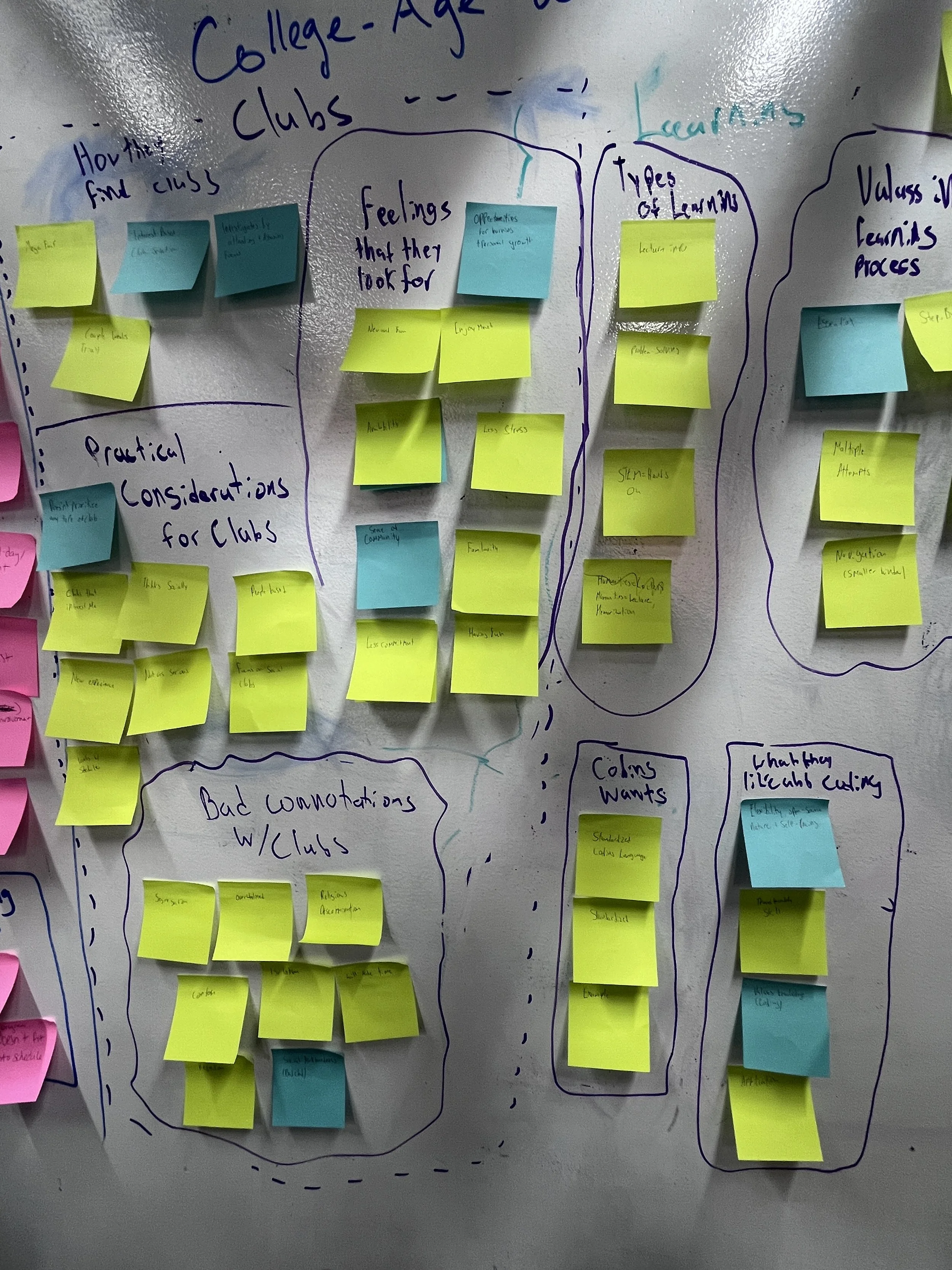
    In this test, we interviewed two of the major target demographics of Girls Who Code (College-aged women and parents interested in signing their child up for a club), and asked them questions that pertain to the organization’s interests. I then took the transcript of the interview and coded it to find major words and themes within the interview. We then combined our interviews and grouped and themed these codes we got out of our interviews using an Affinity Map.

    See our transcripts and codes here.

    See our affinity map and what we found here.

  • Empathy Mapping | GWC

    Using the results of our Affinity Map and our in-depth interview, we then created an empathy map based on these results. It allowed us to identify what this target user is thinking, feeling, saying, and doing when looking for a club for themselves or their child. This test is to help Girls Who Code identify what to feature in their clubs when targeting College-aged women and parents.

    See all of our empathy maps and what we identified here.

  • Usability Test | GWC + Boxhill

    In our usability test, we had four users use the two sites with a set task in mind. While doing these tasks, they spoke about their thoughts and feelings about the process. We recorded their attempts and categorized the setbacks they encountered.

    See our findings in the presentation here

  • Card Sorting | Boxhill

    In this test, we took four people with an unorganized list of Boxhill’s main navigation topics and asked them to sort them into groups and label the groups. We found out that these users preferred less main topic on the visible nav bar, and their subtopics sorted by what the product is, and not its intended use by Boxhill.

    View the results of our Card Sort here.

Previous
Previous

Spotify Brand Analysis

Next
Next

Encore: Entrepreneurial StartUp